
You might think stress comes from work, money, or lack of sleep—but your walls could be quietly contributing. Color psychology shows that the shades surrounding you can influence mood, energy, focus, and even anxiety levels. Because most of us spend the majority of our time indoors, especially at home, paint color becomes more than décor—it becomes environmental input to your nervous system. If a room feels “off” for no clear reason, there’s a strong chance the color is part of the story.
How Color Affects the Brain and Nervous System
Colors are processed by the brain before logic ever kicks in. Different wavelengths of light stimulate emotional and physiological responses tied to the nervous system. Warm colors can raise heart rate and alertness, while cool tones tend to slow things down. This response happens automatically, which means your environment can either support calm and focus—or quietly keep you on edge. Over time, living in colors that don’t match how you want to feel can subtly increase stress, irritability, or mental fatigue without you realizing why.
Why Bright Whites Can Feel Overstimulating
Bright, stark white walls are often marketed as “clean” and “minimal,” but they can be surprisingly stressful. Pure white reflects a lot of light, which can overstimulate the eyes and brain, especially in rooms with strong natural or overhead lighting. For some people, this creates a sense of restlessness or visual tension. White can also feel cold or sterile, triggering a subtle lack of comfort. That’s why many people report feeling unsettled in all-white spaces, even if they look good on social media.
The Hidden Stress of Gray Interiors
Gray has dominated interior design for years, but it’s not always the neutral hero it claims to be. Cooler grays, especially those with blue undertones, can feel heavy, flat, or emotionally draining over time. In low-light spaces, gray can amplify feelings of gloom or fatigue. While it works well in small doses, entire rooms painted gray may lack warmth and emotional support—something your brain quietly craves at home. This is especially true in bedrooms or living spaces meant for relaxation.
Why Red and Orange Can Increase Anxiety
Red and orange are high-energy colors that stimulate alertness and increase heart rate. While this can be helpful in gyms or creative spaces, too much of these shades in living areas can heighten anxiety or irritability. Red, in particular, is associated with urgency and danger signals in the brain. When used excessively at home, it can make it harder to unwind, sleep, or feel emotionally settled. If a room feels tense or chaotic, bold warm colors may be playing a role.
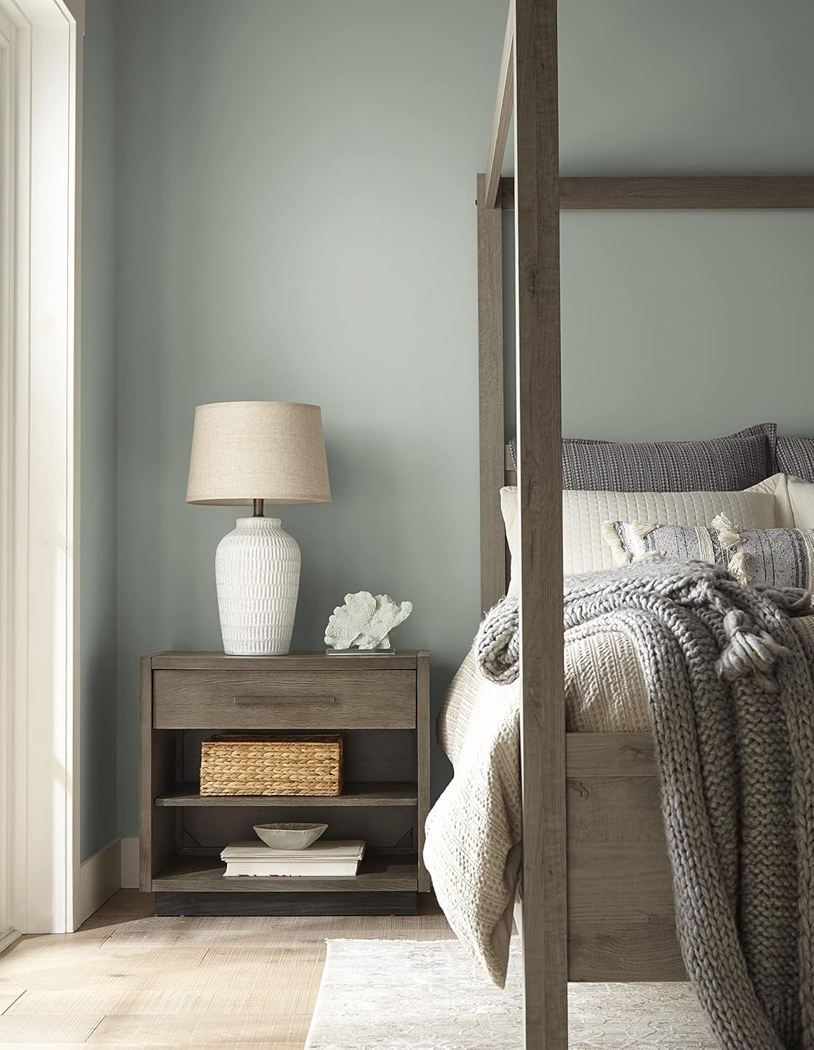
The Calming Power of Muted Blues and Greens
Blues and greens are often associated with calm for a reason. These colors are linked to nature—sky, water, trees—and tend to lower heart rate and promote relaxation. Muted or softened versions work best, as overly bright blues can feel cold or isolating. Green is especially soothing because it sits in the middle of the color spectrum, making it easier for the eyes to process. Bedrooms, bathrooms, and workspaces often benefit from these tones when stress reduction is the goal.
How Beige, Cream, and Warm Neutrals Support Calm
Warm neutrals like beige, cream, taupe, and soft sand tones create a sense of safety and comfort. Unlike stark white or cool gray, these colors absorb light gently and make spaces feel more grounded. They’re especially effective in homes where stress levels are already high, because they don’t demand emotional energy from the brain. Warm neutrals act as a visual exhale, allowing your nervous system to relax rather than stay alert. They’re ideal for living rooms, bedrooms, and shared spaces.
Why Your Bedroom Color Matters More Than You Think
Your bedroom is where your nervous system is supposed to fully downshift. Colors that are too stimulating can interfere with sleep quality, even if you don’t consciously notice it. Deep reds, bright whites, or intense contrast can keep the brain subtly alert. Softer tones—muted blues, greens, warm neutrals, or gentle blush—signal safety and rest. If you struggle with sleep, anxiety at night, or racing thoughts, your wall color may be part of the problem.
Choosing Paint Colors Based on How You Want to Feel
Instead of choosing paint colors based solely on trends, ask how you want each room to feel. Calm, energized, focused, cozy, or grounded all require different visual inputs. Matching color to function helps your environment work with your nervous system instead of against it. Small changes—like repainting one wall or switching to a warmer shade—can noticeably shift how a space feels emotionally.
The Bottom Line on Color and Stress
Your home should help regulate your stress, not add to it. Paint color is one of the most powerful and overlooked wellness tools available. If a room makes you feel uneasy, tired, or overstimulated, trust that feeling—your brain is picking up on something real. Choosing colors that support calm, warmth, and balance isn’t just about aesthetics. It’s about creating an environment that actually helps you feel better.
This post is for informational purposes only and isn’t a substitute for professional medical guidance. As an Amazon Associate, I earn from qualifying purchases – at no cost to you!
Leave a Reply